LOS ANGELES—Helvetica Bold Oblique was the big winner at Tuesday’s 73rd Annual Fonty Awards, taking home 11 statues, including those for Best Sans Serif and the highly coveted 2001 Best Font prize.

The gala event, attended by the biggest names in the publishing and graphic-design worlds, was held at the Shrine Auditorium and followed by a post-ceremony bash at the recently refurbished Linn Boyd Benton Printing House.
“A million thanks to all the wonderful folks in the font community who believed in Helvetica Bold Oblique,” said an ecstatic Oliver Rudd, designer of the font, in his acceptance speech. “Without your faith in my vision, I would not be here before you tonight. I’d also like to thank Helvetica Regular designer James T. Helvetica, the giant upon whose shoulders I stand. And, of course, the designers of the Visa Card Terms & Conditions booklet, who brought my font to the forefront of the American typeface scene this year.”
With its victory, Helvetica Bold Oblique takes its place in a long line of Fonty-winning Helveticas. In the awards’ history, three other variations of the typeface have won Best Font: Helvetica Condensed Light in 1960, Helvetica Ultra Compressed in 1981, and Helvetica Black in 1988.
“The Helvetica font family is highly respected throughout the publishing world,” said Bruce Chizen, president and CEO of desktop-publishing giant Adobe Systems. “Boasting an unequaled range of weights and widths, literally everybody wants to work with it.”
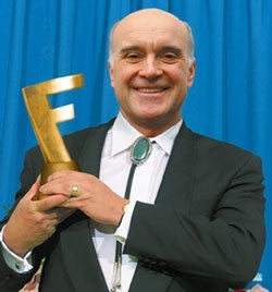
The Fontys, awarded annually by the Academy Of Fonts & Typefaces, recognizes superior achievement in the field of typography. Winners receive a Fonty statue, a golden “F” elegantly styled in freeform.
Awards in 41 categories, including Best Slab Serif Font (American Typewriter Medium), Best Monospaced Font (Letter Gothic Slanted), and Best International Font (Fusaka Regular), were presented during the live, three-hour CBS telecast. Technical subcategories, such as Best Transitional Serif (Apollo Roman) and Best Mathematical Symbol (Lucida Math Symbol) were presented in an untelevised ceremony last week.
“This is the one night of the year when the entire font community, from typesetters to PostScript designers, comes together to honor and celebrate its own,” said Bob Helger, legendary designer of 1990 Best Font winner Utopia Italic. “You could feel the electricity in the air.”
Despite the plaudits heaped on Helvetica Bold Oblique all night, some questioned the academy’s choice.
“A bold as Best Font?” said Christopher Rankley, editor of Typography Today. “They may as well have handed the award to Chicago, for God’s sake. Or, better yet, Chicago Shadow Underline.”
Rankley said he was rooting for the more traditionally tooled Palatino—which snagged just one award, for Best Display Font—to take home top honors this year.
“Palatino is one of the most popular Oldstyle revivals in existence, blending classical Italian Renaissance letter forms with the crispness of line needed for 20th-century printing processes. Yet it has never won Best Font,” Rankley said. “I think a lot of Palatino fans out there were thinking maybe this would be the year.”
A common criticism of the Academy Of Fonts & Typefaces is that it is out of touch with the cutting edge, favoring fonts with mainstream, commercial appeal. Academy members have little awareness, detractors say, of today’s more challenging fonts, such as the daring, highly ornamental Blackletter.
William Perez, a lifelong font enthusiast and editor of the ’zine Lorem Ipsum Dolor, is one such critic, calling the Fontys “embarrassingly conservative and tradition-bound.”
“They think they’re being daring when they nominate a font like Techno or Comic,” Perez said. “What about totally innovative fonts like Critter, with its cute, smiling animal faces rendered into letters, or Giddyup, in which each letter is styled out of a curling lasso? These fonts don’t even exist to the high-and-mighty Academy.”
Perez is not the first to note that quirky, independently distributed typefaces rarely earn Fonty recognition. In the rare instances when cutting-edge fonts are nominated, they are typically relegated to the Best Decorative Font category. Such was the case with the bitstream release Eyeballs, which was nominated for Best Decorative Font but lost out to SnowCap, a long-entrenched favorite of the bagged-ice industry.
Defending his group’s choices, Academy president Jack Tolleson said: “A small, independent font like Goudy Text is masterfully rendered, but it simply does not carry enough national importance to warrant nomination. We cannot justify presenting an award to a font that is barely available for viewing by the public, showing up at only a handful of renaissance fairs across the nation.”
Despite such disagreements, no one objected when this year’s show closed with the presentation of a Lifetime Achievement Award to Times New Roman, a proportionally spaced typeface designed in 1931 for The London Times. When the son of the font’s deceased designer, Stanley Morrison, took the stage, the entire room rose in a standing ovation.
“Such strength of line, such firmness of contour, such economy of space,” said Tolleson, his voice wavering with emotion. “I doubt there will ever be another font like Times New Roman.”