
INDIANAPOLIS—Responding swiftly to a 60 Minutes piece exposing its longtime use of child labor in Malaysian sweatshops, Fortune 500 consumer-goods manufacturer United Home Products unveiled a brand-new logo Tuesday.
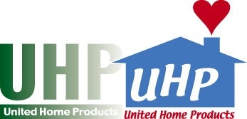
“After the 60 Minutes story aired, we received a lot of tremendously helpful feedback regarding our staffing policies at some of our facilities in the Asian sphere. And after listening to you, our customers, UHP saw it was time for a change,” said CEO Dale Schwantes, gesturing toward the red, white and blue logo. “And here’s that change, America!”
“If you thought you knew UHP, look again!” Schwantes added.
While the business practices of UHP, the nation’s fifth largest manufacturer of household consumer goods, will remain unchanged, the introduction of the new logo signals “a brand-new corporate philosophy and an entirely different way of doing things.”
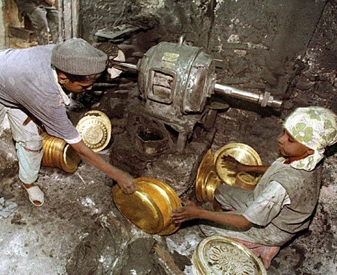
The decision to be “a whole new company” came as a result of the Aug. 5 airing of an exposé on one of UHP’s toaster factories in Songkhla, Malaysia. The report featured footage of 12-year-olds laboring at dangerous machines in unventilated, overcrowded rooms for $5 per week.
Faced with boycott threats from angry human-rights groups, UHP executives decided a major company overhaul was in order. The next day, UHP’s old graphic-design staff was fired and a new 14-member team was brought in.
“America spoke, and we listened,” said Schwantes, reading from a UHP ad slated to appear in next week’s issues of Newsweek and Time. “We’ve got a whole new look… and a whole new outlook!”
Deeply committed to change, Schwantes made certain that the overhaul extended to the entire corporation, and it did: Not only was the new logo placed on all UHP products and packaging, but also on company letterhead, internal memos, embroidered employee polo shirts, and the marble edifice in the front of UHP world headquarters.
“The public made it clear that it didn’t want to support a brand it associated with a cold, gigantic corporation that exploits Third World child labor,” said Mark Ingersoll, head of DesignOne, the San Francisco-based graphic-design firm that created the new logo. “So we totally did away with that harsh, ’corporate-looking’ lettering and went with a friendlier, more inviting font with a little more warmth and visual flair.”
“It sort of brings to mind the old country store on the corner, doesn’t it?” said Ingersoll, who has worked on logo redesigns for, among others, Western Federated Electronics, GenCorp Amalgamated and Global Tetrahedron. “The color scheme is very cozy, but it still conveys confidence.”
Ingersoll said his design team went through “literally hundreds of ideas” before settling on a classic red, white and blue motif for the logo. Among the ideas considered was “UHP” in a child’s handwriting in crayon superimposed over a pair of small handprints, but the idea was nixed when focus groups said it reminded them of the 12-year-old Malaysian factory-laborers.
Thus far, public response to UHP’s transformation has been overwhelmingly positive.
“This logo brings to mind the comfort of hearth and home,” said Margaret Talmadge, a Valdosta, GA, homemaker. “It suggests the warm, inviting arms of a trusted friend.”
“It’s a major improvement,” Rochester, NY, forklift operator John Spillman said. “Seems like they’ve really turned themselves around.”
A handful of skeptics, however, are not convinced that UHP has changed its stripes.
“We’re definitely taking a wait-and-see approach,” said Julianne Foyer, president of the Coalition of Concerned Consumers. “UHP has changed their logo in response to complaints before, only to go back to the same old original design within a year. Why should we believe that the logo will truly be different this time?”
In the past decade, UHP has changed its logo several times. In 1992, when an internal memo from then-CEO Robert Randolph about setting limits on minority hiring was accidentally leaked to the public, the company incorporated a pair of black and white shaking hands into the logo. In 1994, a new green logo featuring a tree coincided with the company’s printing of 800,000 “We Care About The Environment” pamphlets and the relocation of several tons of toxic runoff to offshore storage facilities.
But according to Schwantes, the new logo and new commitment to people is “here to stay.”
“United Home Products is not the same old company,” said Schwantes before handing reporters complimentary vinyl cell-phone holders bearing the new logo. “Take a chance on change: Trust UHP.”